Appearance and themes
Everything on this page is on the Appearance and Fonts and Colors pages of the Settings dialog, and every one of them can be watched live with Show the real switcher while I change these settings.
Size and position
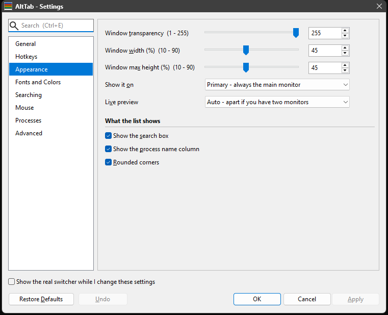
| Setting | |
|---|---|
| Width (%) | The switcher's width, as a percentage of its monitor's width. |
| Height (%) | The most of the monitor's height it may use. It is only ever as tall as the rows it actually has, so this is a ceiling rather than a size. Once the rows would overflow it, a scrollbar appears instead. |
| Show it on | Which monitor: Cursor (wherever the pointer is), Active window (the monitor holding the window you are in), or Primary. |
| Transparency | 0-255. 255 is opaque; the default 222 is very slightly see-through. |
| Rounded corners | Radius 8, matching Windows 11. |
Two of these interact in a way worth knowing. Below 255, the switcher is a layered window, and a layered window's corners have to be rounded by clipping — which works, but the corners are hard-edged. At exactly 255 the desktop compositor does the rounding, which is smooth and comes with the system's drop shadow. If the corners look aliased and you want them smooth, set transparency to 255.
Show it on: Cursor is the one setting the live preview cannot demonstrate: the pointer is on the dialog you are using, so the preview would follow the dialog around. The preview pins itself to the dialog's monitor while it is up, and a real Alt+Tab goes where the setting says.
Fonts and colours

The page is grouped by what is being styled rather than by whether a setting is a font or a colour:
| Group | |
|---|---|
| Search box font & colors | The font, and the text and background colours, of the box across the top. |
| Window list font & colors | The same for the list of windows, plus Selected row. |
| Matched text colors | The two colours used for the letters your filter matched. |
Selected row is [ListView] SelectedBackgroundColor. It used to be the Windows accent colour, which meant the selection stayed the same blue whatever else you changed — including under a dark theme. Now it is yours to set, and a theme picks its own (see below).
The text on the selected row is not a setting: it is chosen for you, black or white, whichever the colour you picked can carry. One colour plus that rule cannot produce unreadable text, where two colour settings can.
Each colour has a swatch you can click to pick from, and a hex box showing 0xRRGGBB — the same form the INI uses, so what you see here is what the file will say. Fonts are a name, a size in points, and a style (normal, italic, bold, bold italic).
A new installation wears the Dark palette, which is what the screenshots and the animations here show — so what you see in this help is what you get before changing anything. The six colour settings underneath still hold AltTab's own scheme -- red on white in the search box, white on black in the list -- because a theme is an override and never writes to them. So those boxes show colours that are not currently in force, and the check box beside them says as much: use the theme's colors instead of the six below. Untick it and the scheme below is what you get, unchanged and exactly as it has always been.
The fonts are not a theme's business at all: Lucida Handwriting at 11 point is the default whichever palette is on. It is unusual, and deliberately part of the application's character; the point of this page is that none of it is imposed on you.
Upgrading from a version before this changes nothing on screen. A settings file that names no theme keeps the palette matching the colours it was written with, whether those are your own or the shipped ones -- so the switcher you had is the switcher you get, and Dark is one dropdown away when you want it.
Themes
[General] Theme names a built-in palette, and use the theme's colors instead of the seven below ([General] UseThemeColors) decides whether it is in charge.
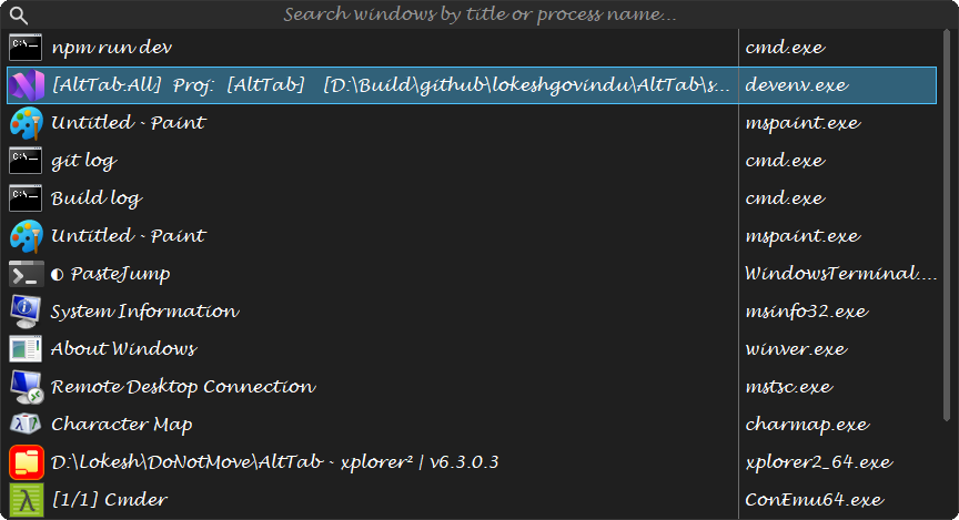 | Dark |
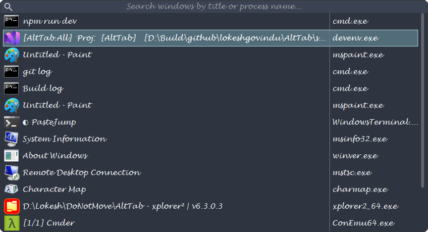 | Nord |
 | Gruvbox Dark |
 | Solarized Light |
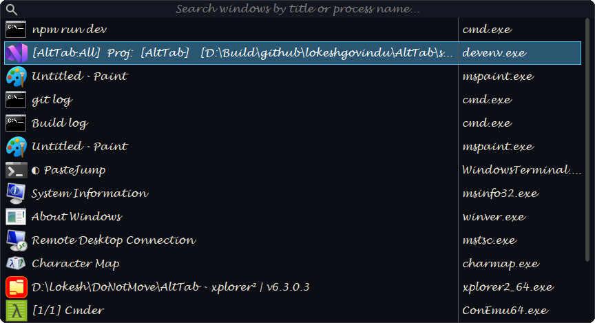 | Ayu Dark |
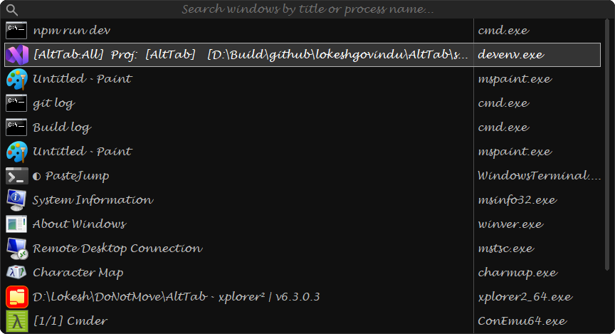 | Grayscale Dark |
Turn the mouse wheel over the theme box to step through them, which with Show the real switcher ticked is the quickest way to see what each one looks like. It is the only control in the dialog the wheel changes — everywhere else a wheel turn scrolls the page, so that scrolling past a combo cannot quietly alter a setting. A theme is the exception because you cannot miss it changing.
There are thirty-one: Default (AltTab's own colours), Light, Dark, and twenty-eight taken from familiar palettes — Midnight, Sepia, Solarized Dark and Light, Monokai, Nord, Dracula, Gruvbox Dark and Light, Zenburn, Catppuccin Mocha and Latte, Tokyo Night, One Dark, Rose Pine, Everforest Dark, Kanagawa, GitHub Light and Dark, Ayu Dark and Mirage, Material Darker, Oceanic Next, Tomorrow Night, Horizon Dark, Selenized Dark and White, and Grayscale Dark. The values are copied exactly, so a palette you know from elsewhere looks the way you expect.
The selected row is outlined in the theme's accent — the same colour the matched letters are picked out in, at full strength. Its fill is that accent pulled most of the way back into the background, so the row reads as the theme's colour without being a slab of it. Where the accent is too close to the fill to be seen as an outline — which happens only with AltTab's own colours, whose accent is red on a blue selection — the frame falls back to a lighter or darker shade of the fill.
Grayscale Dark is black and white on purpose. A window list is not code, so no meaning is carried by colour here beyond the letters your search matched — which is why a monochrome switcher works at all. It tells the matched letters and the selected row apart by brightness rather than hue.
Making one of your own
The palettes above come from the tinted-theming gallery, which shows several hundred base16 schemes side by side. It is the easiest way to find colours you like and the way new AltTab themes are added, so a scheme picked there comes out looking the same here as it does everywhere else you have seen it.
Picking a theme loads its colours into the boxes below. So what those boxes show is always what the switcher is painting with, and changing one of them changes the switcher. There is no mode to be in and nothing to tick.
Once you have changed a colour, the line under the theme name says so, and two buttons decide what happens to it:
- Save stores the colours back into the selected theme. Available only for one of your own — the built-in palettes cannot be overwritten, because a theme called Nord has to mean the same colours everywhere.
- Save as... keeps them as a new theme under a name you choose. It joins the list beside the built-in palettes and stays there.
Delete removes one of yours. The colours stay in the boxes, so nothing is lost until you pick another theme — and if you change the selection with unsaved colours, AltTab asks before loading over them.
Your themes are stored in AltTabSettings.ini as a section each, so Export carries them along with everything else, and one can be written by hand:
[Theme.My Nord]
ListBackground=0x2E3440
ListText=0xD8DEE9
SearchBackground=0x3B4252
SearchText=0xD8DEE9
MatchBackground=0x434C5E
MatchText=0x88C0D0
Those six are required — a section missing any of them is ignored rather than half-applied, and AltTab's log says which one it skipped and why. Two more are optional, Selected and NotResponding; leave them out and they are derived from the six the way every built-in palette's are. A theme cannot take the name of a built-in one, since that would make the built-in unreachable.
To use a scheme that is not built in, take its colours into the six settings above and leave Use the theme's colours unticked — or better, save the result as a theme so you can switch back to it. Four of the scheme's slots are all you need:
| base16 slot | AltTab setting |
|---|---|
base00 | [ListView] BackgroundColor — the window list |
base05 | [ListView] FontColor and [SearchString] FontColor |
base01 | [SearchString] BackgroundColor — the search box |
base02 | [ListView] HighlightBackgroundColor — behind matched letters |
base0D | [ListView] HighlightTextColor — the matched letters themselves |
A light scheme wants one change to that: its base02 is a mid grey, so put a pale tint behind the matched letters instead, or they stop standing out.
Your colours are never loaded over without being asked. Change the theme while the colours no longer match it and AltTab offers to keep them first — Save into the theme they belong to, Save as a new one, or discard them. Nothing else touches those settings: a theme named in the file does not reach into them on its own, only a selection you make in the dialog does.
Themes decide colours only. The fonts stay yours.
Upgrading. A settings file with no
Themekey is one written before themes existed, and it is left looking exactly as it did. If its colours are your own,UseThemeColorsis switched off on load so they keep showing; if they are the shipped ones, the theme is pinned to Default, which is those same colours -- so the change of default palette to Dark reaches new installations only, and never repaints a switcher behind its owner's back.
What "not responding" looks like
A row whose window has stopped answering gets [ListView] NotRespondingBackgroundColor, which is a colour row on Fonts and Colors under Window list. When a theme is in charge the colour is derived from that theme's own background rather than being a fixed red, so it stays in the palette's family — and it is checked against the row's own text colour, so the title stays readable on it in every one of the thirty-one themes.
Every colour the switcher works out for itself has a measured floor. The themed selection, the hover outline, this row, the matched letters and the search box's placeholder are all blends of palette values, and a blend that reads well on a dark palette can vanish on a light one — several did. Scripts/check_theme_contrast.py measures all thirty-one palettes against WCAG contrast ratios and the application enforces the floors in code, so a theme cannot leave text you cannot read.